Re Branding & Design for Tech brand
Client
Pailtech Solution
Tech ecommers
Industry
Services
Rebranding, Packaging and website design
Addressed the brand positioning issue by modernizing your client’s outdated logo and identity, aligning it with their focus on high-quality refurbished tech products. The rebranding emphasizes innovation, sustainability, and trust, positioning the brand as a reliable, eco-conscious leader in the refurbished tech space. This transformation enhances customer perception and supports future growth by clearly communicating the company’s expertise and commitment to delivering premium tech solutions.

Founded in 2017, Pailtech was found with the aim to carve a name of its own in the refurbished tech industry by providing high-quality, eco-friendly refurbished products. With a focus on sustainability, the brand quickly became a trusted source for premium refurbished computers, laptops, desktops, CCTV systems, RAM, and other tech solutions. Driven by a passion for technology and the environment, the founder, a young and energetic entrepreneur, sought to bridge the gap between affordable, reliable tech and the growing demand for eco-conscious choices.
Recognizing that the original brand logo didn’t reflect the tech-forward and the true nature of the business, a rebranding effort was initiated to position the company for future growth. The new visual identity aligns with the brand’s mission of delivering sustainable, high-performance tech solutions while staying ahead of industry trends. Today, the brand stands as a leader in the refurbished tech space, offering businesses and consumers an opportunity to make smarter, greener technology choices without compromising on quality.
Old Logo
The original logo, featuring the letter "P" with a GPS symbol, confused customers into thinking the company was focused on location technology, despite specializing in refurbished tech products.


Logo Idology

For the rebrand, I combined three key elements: a box symbolizing
e-commerce, the letter "P" representing the brand, and a growth arrow to signify the company’s expansion beyond its core. This new logo effectively reflects the brand's focus on refurbished tech and its future growth trajectory.
Logo Varation
To ensure flexibility and consistency across different platforms and media, brand variations were designed. It allows the brand to maintain visual identity coherence while adapting to various applications, such as digital, print, or packaging. These variations ensure the brand stays recognizable and impactful, regardless of size or medium.


Brand Color
The primary color orange in the new logo symbolizes energy, enthusiasm, and innovation—qualities that align with the young, dynamic nature of the brand and its commitment to providing cutting-edge refurbished tech solutions. Blue, the secondary color, represents trust, reliability, and professionalism, crucial for building confidence in customers seeking high-quality, sustainable products. The gradient effect adds a modern, tech-forward touch, reflecting the contemporary trends in the tech industry and reinforcing the brand's adaptability and growth potential in the ever-evolving market. Together, these colors convey a balance of creativity, reliability, and future-readiness.

Brand Pattern
Brand patterns were designed to create a cohesive, recognizable visual language across all touchpoints, enhancing identity, memorability, and versatility, while ensuring consistency in digital, print, and packaging materials.
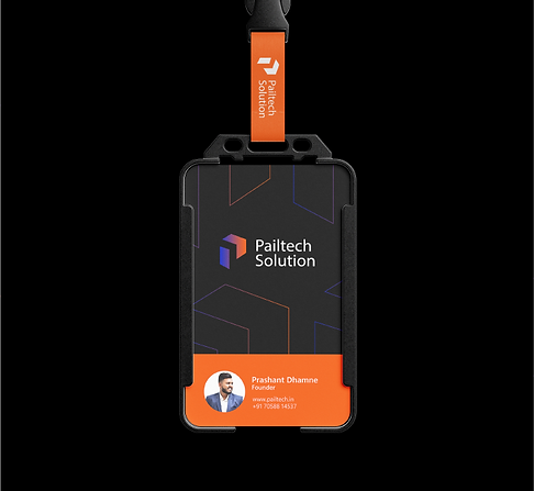
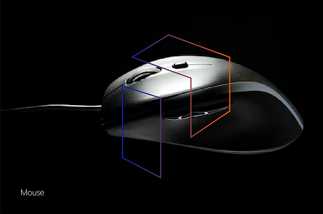
Pailtech Product
Pailtech offers a range of high-quality refurbished tech products, including computers, laptops, desktops, CCTV systems, RAM, and other tech solutions.


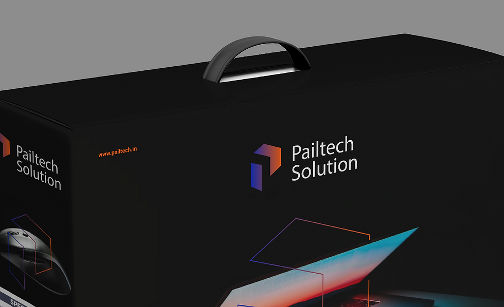
Packaging
Previously using simple third-party packaging, the client now utilizes customized packaging to enhance the premium look and feel of their products. This new packaging solution reflects the brand's commitment to quality, providing a more professional and elevated customer experience.
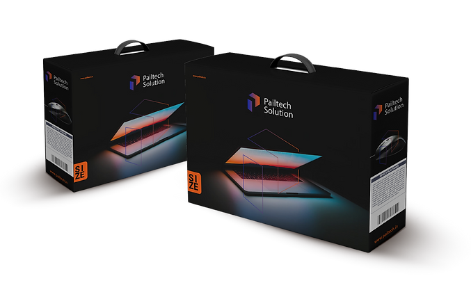
Packaging
Given that The Flour Connects is a new venture, the project focused on original branding rather than rebranding. This included the development of a unique logo, color palette, typography